eTextbook Digital Publishing


The Challenge
Create an Online User Interface for an Educational electronic Textbook
A leading educational publishing company wanted to create a branded look for their eTextbook division.
They needed a user interface design that was engaging, modern and relatable for younger sophisticated audiences.
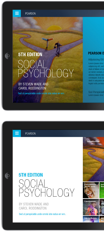
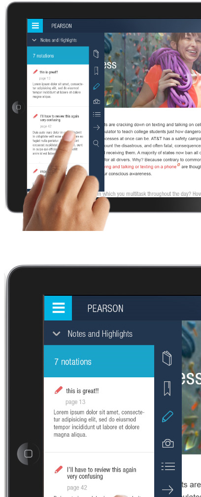
The approach was to incorporate clean colors and bold typography in a mobile style aesthetic.
Refined typography, photo tiles and pencil thin, hand drawn icons were used to create a high end web experience and capture the reader's imagination, in a familiar web experience.
Two concepts were developed using serif and sans serif fonts, with two optional color schemes.